
Software
- How I got the scripts going in starts and stops as I figured out the issues in having them always running.
- A macOS update that I started before heading out for a few hours, which led to a large gap because I still have all of this on my desktop Mac.
- The dots show how some data was reduced in granularity overnight because of device settings that put it to sleep. So I changed those settings the next day.
-
The Matrix (1999) • 8.7
Lana Wachowski, Lilly Wachowski -
City of God (2002) • 8.6
Fernando Meirelles, Kátia Lund -
The Intouchables (2011) • 8.5
Olivier Nakache, Éric Toledano -
Avengers: Endgame (2019) • 8.4
Anthony Russo, Joe Russo -
Avengers: Infinity War (2018) • 8.4
Anthony Russo, Joe Russo -
No Country for Old Men (2007) • 8.2
Ethan Coen, Joel Coen -
Monty Python and the Holy Grail (1975) • 8.2
Terry Gilliam, Terry Jones -
Gone with the Wind (1939) • 8.2
Victor Fleming, George Cukor, Sam Wood -
Everything Everywhere All at Once (2022) • 8.1
Dan Kwan, Daniel Scheinert -
The Big Lebowski (1998) • 8.1
Joel Coen, Ethan Coen -
Fargo (1996) • 8.1
Joel Coen, Ethan Coen -
The Wizard of Oz (1939) • 8.1
Victor Fleming, King Vidor, Richard Thorpe, Norman Taurog, Mervyn LeRoy, George Cukor -
Slumdog Millionaire (2008) • 8.0
Danny Boyle, Loveleen Tandan -
Sin City (2005) • 8.0
Frank Miller, Quentin Tarantino, Robert Rodriguez -
Captain America: Civil War (2016) • 7.8
Joe Russo, Anthony Russo -
Captain America: The Winter Soldier (2014) • 7.8
Anthony Russo, Joe Russo -
Little Miss Sunshine (2006) • 7.8
Jonathan Dayton, Valerie Faris -
O Brother, Where Art Thou? (2000) • 7.7
Joel Coen, Ethan Coen -
True Grit (2010) • 7.6
Ethan Coen, Joel Coen -
The Butterfly Effect (2004) • 7.6
Eric Bress, J. Mackye Gruber - Most of the films here are from the last twenty-five years. Gone with the Wind and The Wizard of Oz are the two remarkable exceptions, surprisingly from the same year, 1939, and with the same main director, Victor Fleming.
- Gone with the Wind has a runtime of 238 minutes, which is far above any other film here, and that makes it additionally remarkable that it is on this list.
- Everything Everywhere All at Once was a surprise to see here, given its newness. I wonder if its rating will go up or down with time.
- I have seen seventeen of these films. The others are now on my to-watch list 😄
- Only movies. This eliminated shorts, TV, etc.
- Not animated. Apparently it is common for animated movies to have more than one director, so they were sort of skewing the results away from what I really intended to discover, even though I didn’t realize it at the time I asked myself that leading question.
- High rating (> 7.5) and high number of votes (> 250000). I tweaked these to narrow down a short list. If I only maximized one or the other, the results didn’t seem representative of the question.
- Year of release used as a tie breaker. I figured a more recent film with a high rating had a larger impact on the zeitgeist and so deserved to be higher on the list.
- Retrieve the page that lists kittens.
- Use some regular expressions to get the relevant data out.
- Open a local JSON file of saved kittens from the previous run so that the new kittens can be identified.
- If there are new kittens, use Pushcut to send a notification to my phone (and watch).
- If the notification is successful, save the list of currently available kittens in a local JSON file for referencing in the next run.
Vibing Pi o'Clock
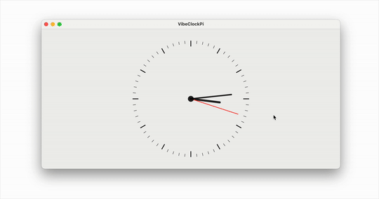
When I wrote up Piterator.swift on Pi Day earlier this month, I was actually trying to do something with the values it returns but I didn’t get around to that fun part due to lack of time.
A few days after that I imagined a clock face where the seconds hand moves in jumps of the values returned by the iterator at the rate of once per second. So as the values start coming in like 3, 1, 4, etc, the second hand jumps by those many seconds.
I started to write the code for a Mac app but Quartz 2D drawing is not something I have ever really done, so it was tricky wrapping my mind around the coordinate system and laying out individual marks on the canvas.
Fast forward to yesterday when I decided to try out vibe coding for this project. As I got going though, it became more of an AI assisted coding because I started to edit it myself after a couple of initial rounds of code generation. Old habits die hard!
For this purpose I used the recently released Google’s Gemini 2.5 Pro via LLM, essentially as described in this post.
I was very impressed by the code generation. The first prompt I gave was for a static drawing, and it was thus:
llm -m gemini-2.5-pro-exp-03-25 "Write a SwiftUI View that draws a clock face on a Canvas. It should draw each of the 60 tick marks, with 0 and every multiple of 5 being a slightly thicker tick mark. It should also draw the time using an hour hand, a minute hand and a second hand. The second hand should be red. The time should be 10th hour, 10th minute, 30th second."
The result was exactly as I expected. It even improvised and put that little circle in the center which was a nice touch.
Then I gave it this second prompt which also included the Piterator.swift code:
files-to-prompt . -e swift -c | \
      llm -m gemini-2.5-pro-exp-03-25 -s \
      'Update the ClockView to make it animatable using TimelineView. Then hook it up to Piterator so that every second, the second hand moves forward by as many seconds as the number returned by the Piterator.'
This generated code that had a couple of small bugs that raised compiler errors. After I resolved that I had it working exactly as I envisioned it, and the whole thing took about an hour 🤯
Yesterday it dawned on me that it was Pi Day Eve, so obviously, I whipped up a little Swift iterator that iterates over values of Pi from Pi Delivery. You can get it at this gist.
Use it in your swift code and make fun stuff using the value of Pi up to 100 trillion digits!
Happy Pi Day!
70 Flights on Mars
When Perseverance rover landed on Mars, it brought along a little helicopter in its belly. The helicopter, named Ingenuity, was a 30-day technology demonstration sent to see if we could fly an aircraft in the very thin Martian atmosphere.
As is often with NASA’s robotic missions to Mars in recent times, it did that, and exceeded all expectations. It became a companion to the rover and performed about 70 flights over the nearly three years that it flew on Mars. Then last month it encountered an accident that left one of its propeller damaged. That ended the mission.
I’ve been fascinated by this little flying helicopter and have often looked at the photos it was sending back. So much so that I have now compiled a video of all the photos taken by the navigation camera on Ingenuity. This downward pointing camera photographs the ground below it, and so the helicopter is always seen by its shadow, scuttling about the Martian landscape for a cumulative 17 km (10.5 miles) over its mission timeline.
No doubt, Ingenuity has shown that a flying robot is a very useful tool in exploring Mars, like wheeled rovers showed over the last few decades. Perhaps enough that future missions will bring more along.
For more information and a lot more interesting media, like the locations of all these flights, check out its official website.
A New App, Maybe
Some time ago I wrote about a simple app I made to export routes for workouts so that I can embed them in blog posts, or Google Maps.
Well, I kept making improvements to it to the point that now it looks like an interface to my workouts that I prefer over the standard one from Apple (like supporting light and dark modes 🙄).
What do you think? Would you be interested in using it? Should I start a beta so you can share how you really feel?
P.S. Many of the map tiles are blurred because one of the features of the app is to enable blurring them out if they contain any user-defined private locations, e.g. for sharing such a video, or a screenshot.
An App for Mapping My Outdoor Activities With Apple Watch Using GPX Tracks
I use an Apple Watch to track my activities, whether that be workouts or recreational. For outdoor activities, the watch records location data throughout the activity. This is later shown on a map in the Fitness app on the iPhone. While that map is interactive, exporting it only exports a low resolution image, and not the actual route.
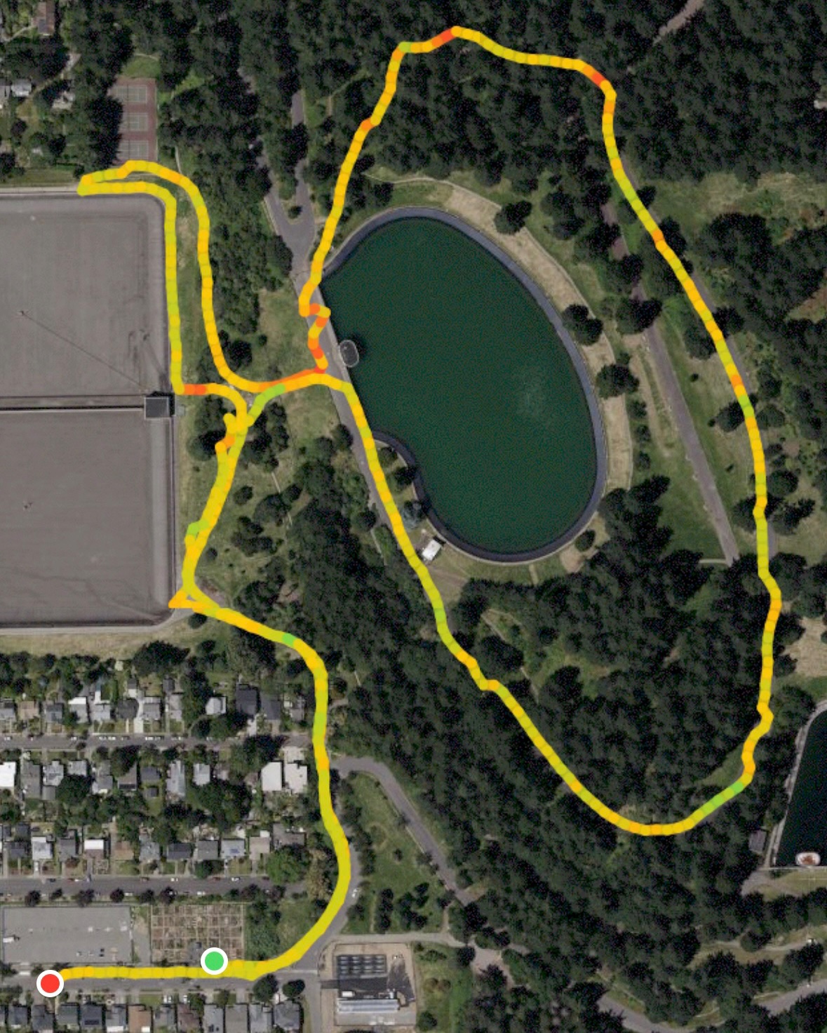
When I share an activity on a blog post I like to show the map but I don’t like the idea of just sharing an image of the map. I would like to get the actual data out so that it can be overlaid on an interactive map using various mapping tools.
I found an app on the App Store that can export the data, among many other features, but I wasn’t keen on paying a subscription for this one small occasional use case. As an app developer, I know that access to this data is controlled by the Health related privacy settings on the iPhone and is accessible using the HealthKit framework. So I decided make a small app to get this data out while also gaining familiarity with that part of the iOS SDK. A few weeks ago I got started on it. I worked on it in small chunks of time, as I usually do with such side projects. The UI came together pretty quickly as a SwiftUI app. It is nothing special but looks presentable and gets the job done.
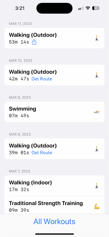
It took just a little bit longer to get the data out from HealthKit. Converting it to GPX files was straightforward. Once I had created a file I could use the share sheet to get it into other apps or to simply save it. From there it can be imported into tools that put it on a map.
For example, here’s a GPX file of a walk at Mount Tabor Park. It can be utilized to create an embedded map as shown below.
Or even into Google Maps. In fact once imported there, you can view the track with elevation by selecting the option for Google Earth and enabling the 3D view. I love this option as it adds another dimension (literally 😂) to the activity.
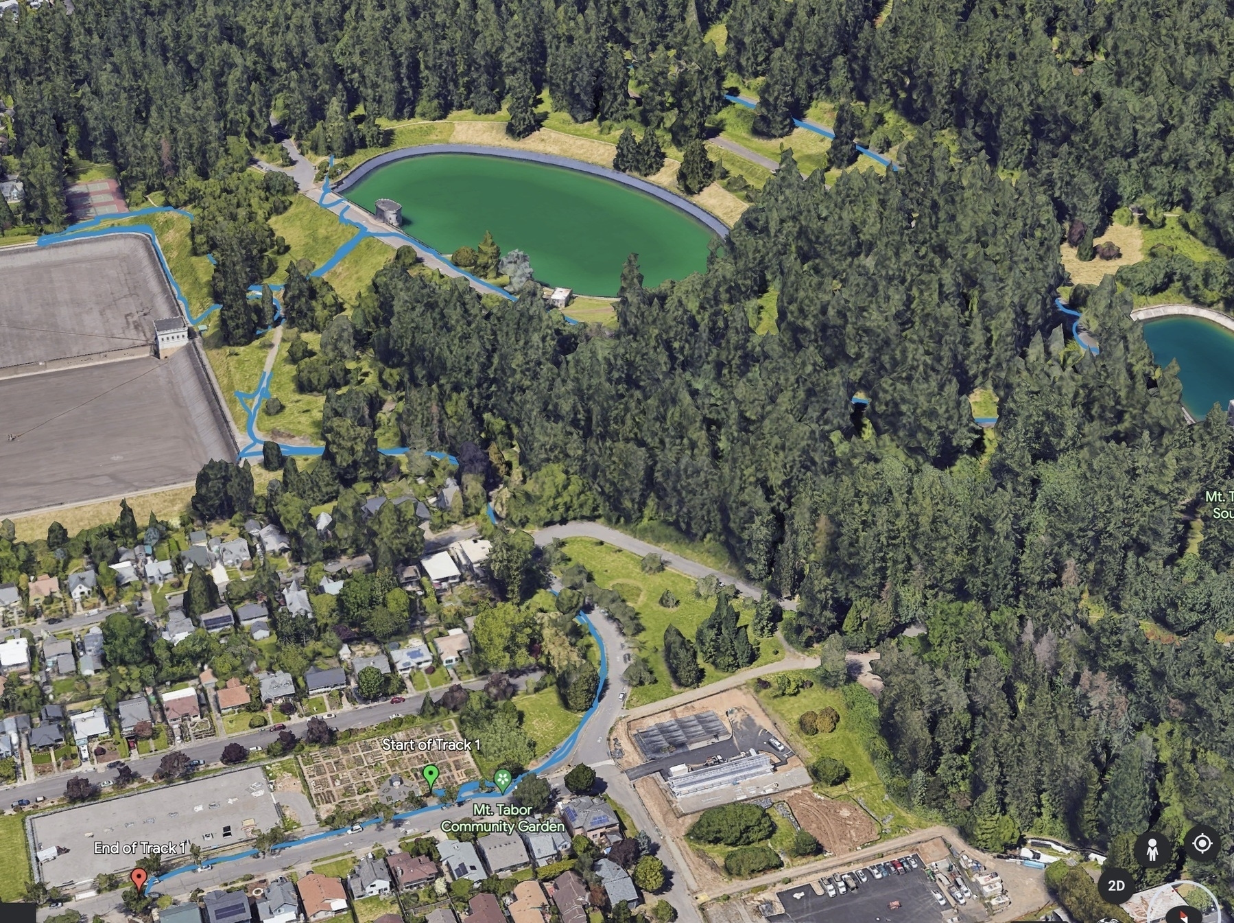
Both these presentation styles are far more interesting to me than just a low resolution image out of the Fitness app.
Adding API Accessible Devices to the Home Climate Monitoring Setup
I was thinking about getting more of those AcuRite sensors for expanding my home climate monitoring when I realized that I already have a couple of devices recording this and other data.
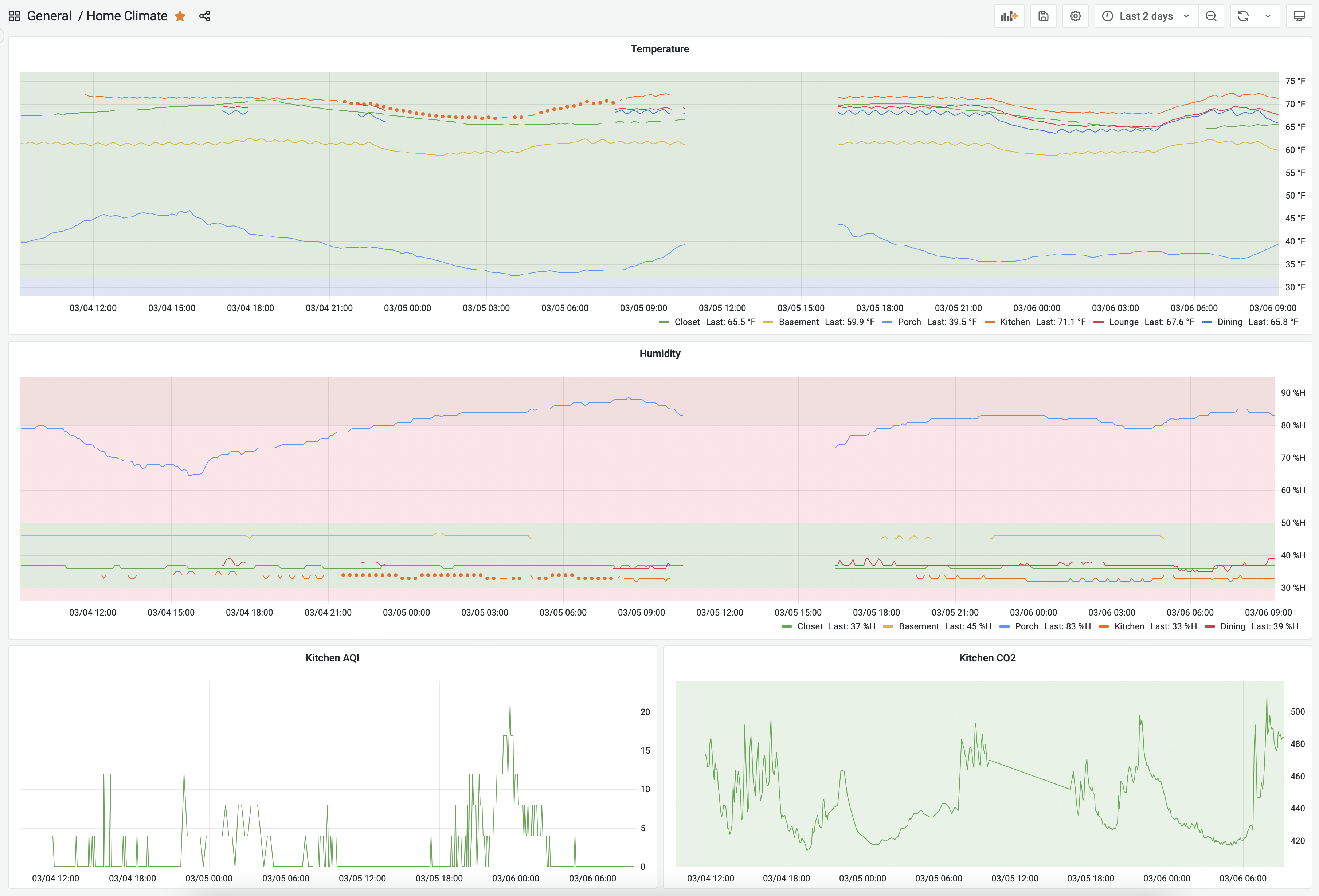
These include my Ecobee Thermostat and Remote Sensor and my IQAir AirVisual Pro. Both of these have means of getting the data off of them using an API. This blog post by Den Delimarsky really helped with the IQAir API. Ecobee API was straightforward. And after some coding and testing, I had a couple of scripts running that could pull metrics from them and send them to influxdb. So now I have a few more data points for existing metrics, and have added air quality to it.
In the previous blog post , I wrote:
I’m going to take a break from any further optimizing/tweaking for now.
Well, that didn’t happen! But maybe now 🤔
P.S. The screenshot above illustrates a few other things:
Home Climate Monitoring
Sometime last year my friend Andrew made me aware of the sensors and software he was using to monitor temperature and humidity in his home. I thought that was cool and it introduced me to several hardware and software tools that I had not known about. I wanted to set this up at my home so I filed a project for a later date.
Well, that day arrived a few weeks ago and here’s what it looks like today:
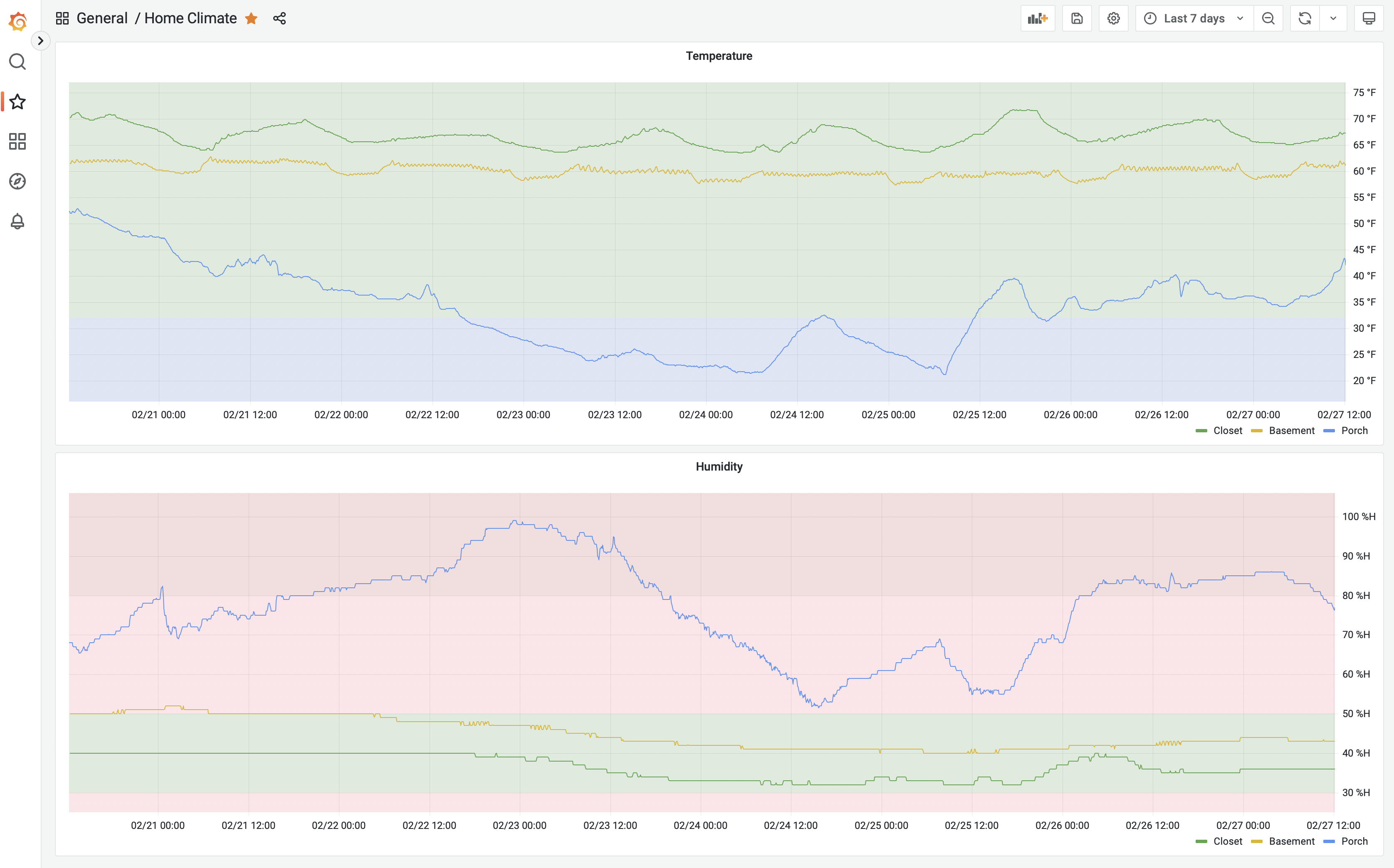
To get started exploring this I purchased an AcuRite bundle of three sensor towers and one display. I set up the towers around my home and put the display in my home office. It was neat to see the display showing the measurements at any given time. Soon I wanted to go to the next level and record and see the data over time.
These sensors broadcast the data over 433 MHz and there are consumer level antennas and software available to read this data. I bought a NooElec bundle which gave me all the hardware I needed to receive this data on my computer. Setting it up was straightforward. I used rtl_433 and was able to start seeing the wireless data immediately in the terminal on my Mac.
The next step was storing all this data. That’s where influxdb came in. And the glue to get it from rtl_433 to influxdb involved MQTT and telegraf.
There was a lot of trial and error but I finally got it all set up and was able to get the data into influxdb. I even made a dashboard in there to visualize it. The options on that dashboard were limited so I got grafana set up and built a dashboard in that which can be seen at the top of this post as seen on my desktop browser. It also looks great on mobile devices.
Except for rtl_433, the rest of the tools all run on docker on my desktop Mac. At some point I may migrate that off to a Raspberry Pi but for now it’s all working and I’m going to take a break from any further optimizing/tweaking for now.
Update (6th March, 2023): Follow up post about expanding on this effort.
Playing with the IMDb dataset to find top movies that have multiple directors
I was playing with the pandas library on python and picked the IMDb dataset to explore.
To give myself a learning goal, I asked the following question:
What movies are generally regarded as the best that have multiple directors?
After some finagling the dataset (of multiple large CSV files) I arrived at the following list of twenty, in descending order of average rating:
Some thoughts on these results:
Notes on the data filtering and sorting process to get to the final list:
The script can be found here.
P.S. The dataset obviously has biases and those impact the results.
A video of every image from the navigation camera on Ingenuity helicopter on Mars
There’s a little solar powered helicopter on Mars. It’s named Ingenuity and it has a little camera on its belly that looks downwards. This video has every image taken by that camera from the first one on April 3, 2021 (Sol 43) until today. Ingenuity is 19 inches (0.49m) tall and weighs 4 lbs (1.8kg).
Note: This video has no audio.
Credit:
NASA/JPL-Caltech/Sam Grover
Upload images using Mimi.
I was playing around with Mars 2020 (Perseverance rover) image data and made this data visualization of images from all the various cameras on board that mission.
Note: This video has no audio.
Credit:
NASA/JPL-Caltech
NASA/JPL-Caltech/ASU
NASA/JPL-Caltech/CAB
NASA/JPL-Caltech/LANL/CNES/IRAP
Upload images using Mimi.
Extract URL From Apple News URL
I wrote a small script to convert an Apple News URL into a regular URL. Here it is.
I usually need this on macOS and have a terminal handy so a Python script works well for me. You could extract the logic and make a different automation out of it, e.g. an iOS Shortcut. Do share if you do :-)
Script Kitty
We wanted to adopt a kitten from the Oregon Humane Society. In these days of the pandemic, their adoption process has changed and you’re only allowed to apply online. So we checked their website regularly. That’s when we noticed that demand is very high these days so the window to apply was very short. New kittens would get posted but by the time we noticed and applied, they would already have been spoken for. This went on for a week or so.
So I did what any programmer might do, I implemented a script to detect when new kittens are posted. It was run every five minutes for about three weeks. Now it has been retired with the arrival of Mr. Momo a few weeks ago.

The script flow is pretty straightforward:

It was loaded as a launchd service on my always-on Mac, which I manage using LaunchControl.app.
Here’s the script in its entirety:
😻
Importing Foursquare/Swarm history into Day One
I’ve been journaling in Day One for some time now. I like it for a lot of reasons, and it’s working out great. So far I’ve been using it as a plain old journal, where you write what’s on your mind. Recently, I decided that I wanted to get my digital history into it as well. One of the first things that came to mind was my Foursquare/Swarm checkin history which goes back to 2009. I decided to start there.
I exported all my data and wrote a script in Python to extract what I needed from it to make journal entries. The two relevant files were checkins.json and photos.json. You can get my script on Github by selecting here if you’d like to use it, or dig into it. It should also appear embedded at the end of this post. First the script pre-processes the data to get all the photos attached to checkins. Then it goes over the checkin history to extract most of what I want, but since the exported data doesn’t include venue coordinates, it has to do a little more.
It makes calls to the Foursquare API to fetch the venue coordinates for each checkin. Then it puts everything together and makes the actual entry using Day One’s command line utility. I had several thousand entries but the free plan for the API has a daily limit of 500 calls, so I manually ran it a few times over the course of a couple of weeks until they’d all been imported. I could’ve automated that but I wasn’t keen on spending the time on that.
Day One does allow one to link it to IFTTT so that all new checkins get logged automatically, and I enabled that a while back, but I’ve not been happy with that integration. Now that I’m familiar with the flow of data, I plan to create new entries every couple of months or so, perhaps with a new script that works entirely with the API.
I’d love to hear if you have automated any journaling as I’m keen to explore other ways of doing so myself.